- Like
- SHARE
- Digg
- Del
- Tumblr
- VKontakte
- Flattr
- Buffer
- Love This
- Save
- Odnoklassniki
- Meneame
- Blogger
- Amazon
- Yahoo Mail
- Gmail
- AOL
- Newsvine
- HackerNews
- Evernote
- MySpace
- Mail.ru
- Viadeo
- Line
- Comments
- Yummly
- SMS
- Viber
- Telegram
- JOIN
- Skype
- Facebook Messenger
- Kakao
- LiveJournal
- Yammer
- Edgar
- Fintel
- Mix
- Instapaper
- Copy Link
It has been a busy couple of weeks at Engadget and we have many reviews to recap. Nathan Ingraham reviewed the newest base iPad as well as the Microsoft Surface Go 3, the latter of which he says lacks the processing power to be more than a secondary machine. Devindra Hardawar reviewed Windows 11, which he called both refined and frustrating, and the Microsoft Surface Laptop Studio, which he enjoyed but found it to be underpowered for the price. Also, Dana Wollman checked out the Surface Pro 8 two-in-one, which solved some problems but created others with its new, higher price tag.
Microsoft’s Surface Pro 8 still lacks an included keyboard
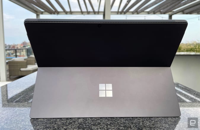
Dana Wollman was pleased to see that the Surface Pro 8 addressed some of our complaints about the previous version. It has a redesigned, larger display with skinnier bezels, improved resolution and a 120Hz refresh rate, along with 11th-gen Core i5 and i7 processors and a slightly higher-res rear camera. But the detachable keyboard is still sold separately for $180, and the two-in-one starts off more expensive at $1,100. It’s also 15 percent heavier at 1.96 pounds without the keyboard. Dana says that’s lighter than her MacBook Pro, but that doesn’t make it an ideal mobile device.
The built-in kickstand seems to indicate the machine is best used when docked, not held. Dana said the kickstand is premium, albeit a bit awkward to pull out due to the narrow divots. She was underwhelmed by the images from the 10-megapixel rear camera, though it can record in 4K, and she was more impressed by the webcam that proved to be capable even in mixed lighting. The 120Hz refresh rate is a major improvement and she says you won’t want to revert back to 60Hz even if it helps save a bit of battery life. She also appreciated the Slim Pen 2, which has a haptic motor that made it fun to use. However, she admits that the higher price point makes the Surface Pro 8 even more of a niche item.
The Surface Go 3 still isn’t powerful enough
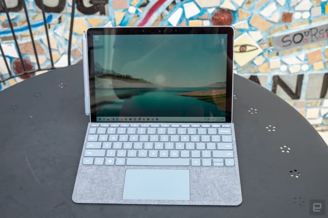
Nathan Ingraham likes many of the features of the Surface Go 3: it’s well-built, has a lovely and responsive touchscreen, a strong kickstand and is extremely light and portable. However, like the Surface Pro 8, it doesn’t come with a keyboard and you’ll definitely need one as Windows 11 still doesn’t offer up a stellar tablet experience. The bigger issue for him was the underpowered specs and average battery life. The model he reviewed came with a 10th-generation Intel Core i3 processor, 8GB of RAM and 128GB of storage.
That makes for a mostly capable machine for basic tasks, but Nathan experienced occasional music stutters and had to reload tabs during his workday. He noticed lag while working in Adobe Lightroom, and had issues during video calls while jumping into other programs. During his normal work routine, the battery lasted five hours, which detracts from the device’s portability. However, he liked the 10.5-inch, 1,920 x 1,280 touchscreen and the 3:2 aspect ratio as well as the infinitely adjustable kickstand. While Nathan says he can see the Surface Go 3 working as a secondary machine for travel, it’s hard to recommend as a daily driver because of its performance and battery life issues.
The Surface Laptop Studio could use more cores
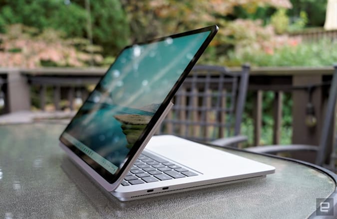
One of the first Windows 11 PCs, the Surface Laptop Studio has a 14.4-inch screen with a speedy 120Hz refresh rate and weighs around four pounds. Devindra Hardawar says while it’s clearly not trying to be an ultraportable, it is ultra-adjustable thanks to the display that tilts it into various angles. The display itself entranced him with its flexible hinge, fantastic Dolby Vision support and refresh rate, though it is surrounded by chunkier bezels. He said the speakers are surprisingly powerful thanks to the two subwoofers on the sides and the tweeters blasting through the keyboard.
While Devindra found the Laptop Studio to be a solid performer for everyday computing tasks — and fast enough to play Overwatch at 90 and 100fps — it has only a quad-core chip, and that makes it hard to recommend when so many similar machines feature more powerful six- or eight-core CPUs. He was also annoyed by the anemic port situation: two USB-C ports, which support ThunderBolt 4, and a proprietary Surface Connect slot, but there’s no longer an SD card slot, which would have been an opportunity to outdo the competition. At least Microsoft included the excellent keyboard from the Book 3 and the new Surface Slim Pen 2. While Devindra genuinely liked using the Surface Laptop Studio, he said he still wanted more power overall.
Windows 11 is polished and secure — but frustrating
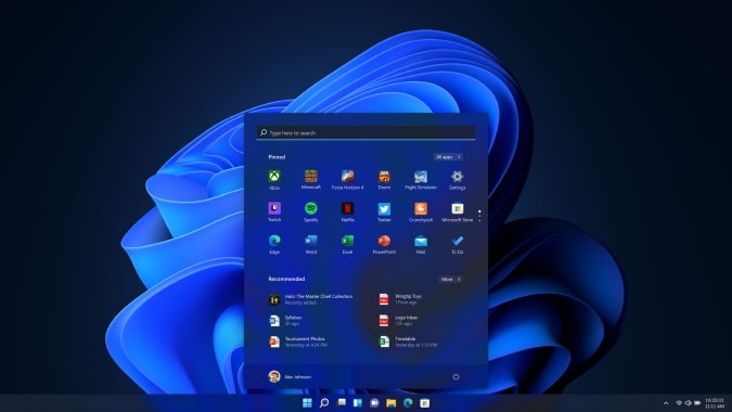
Devindra Hardawar doesn’t think that Microsoft is trying to fix much with Windows 11. Although the new operating system is more of a coat of paint over Windows 10, he doesn’t feel that’s a problem. Devindra says the more he uses the OS, the easier it is to see how far the small design tweaks have taken the software. The taskbar now has centered icons, the Start menu has a redesigned look with pinned apps, windows have rounded corners and the icons, Explorer and Settings apps look sharp making for a more refined feel overall.
The system requirements are a bit more rigid: compatible Intel, AMD or Qualcomm processor, 4GB RAM, at least 64GB storage and you’ll have to enable Secure Boot and Trust Platform Module 2.0 which make it harder for spyware and malware to attack. This means there are some additional complications if you’ve got older hardware or if you’ve built your own PC. Windows 11 will also be the only way to use Microsoft’s DirectStorage technology, which Devindra says should dramatically speed up load times when it’s available. He says that the combination of a refreshed look, additional security and faster performance is a step forward — just not a momentous one.
The 2021 iPad is an incremental update
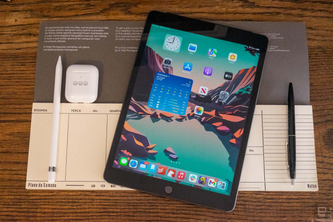
The 2021 refreshed iPad isn’t for early adopters like Nathan Ingraham. The updated tablet now includes a 12-megapixel front camera with Center Stage support, double the base amount of storage, the new A13 Bionic chip and iPad OS 15. However, the hardware is largely unchanged from the previous two versions. It has basically the same size and weight and still includes a 10.2-inch, 2,160 x 1,620 touchscreen, an 8-megapixel rear camera and a Lightning port for charging.
That means that this is an iPad meant for those who want a tablet that’s fast, lightweight, easy to carry around and (relatively) cheap. For most standard iPad users — those who use a tablet primarily for things like playing games or browsing the web — the new chipset will provide more than enough power. Nathan didn’t notice any slowdowns while multitasking with several open apps, though he did notice that some apps needed to refresh more frequently during those periods. Also, while the screen was serviceable for watching videos and playing games, it can’t compare to the screens on the other iPads in the lineup. But for $330, as Nathan says, who cares? If your iPad is more than a few years old, you’ll find some significant improvements in this one.
The Fitbit Charge 5 has a slick full-color display
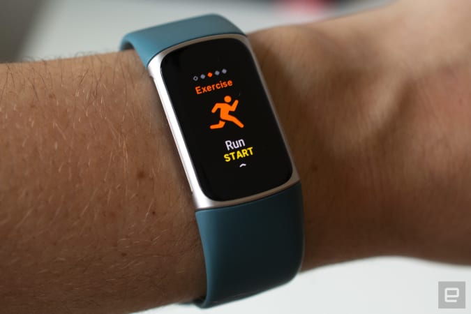
Though the first thing you’ll notice about the new Fitbit Charge 5 is the 1.04-inch color AMOLED touchscreen. Valentina Palladino says that the changes made to the wearable — rounded edges and a 10-percent thinner body — made it more comfortable to wear as well. The fitness band also now has some more advanced features like ECG measurements and EDA monitoring for stress levels. The ECG measuring is coming soon and Valentina said that the EDA monitoring wasn’t intuitive and left her frustrated. She had better luck with the built-in GPS, which immediately picked up her location and accurately mapped her running route.
Valentina also liked the alarm and timer apps, which she found helpful throughout the day. However, she was disappointed that Fitbit removed some of the music-focused features, which meant she had to pull out her phone to skip a track or control playback. She was also a bit irked to see that some of the Charge 5’s more advanced metrics, like select sleep and exercise data, were part of Fitbit’s subscription service that costs $10 per month. But she did applaud the battery life and the inclusion of Fitbit Pay with NFC. She says if what you’re looking for is a low-profile wearable with a focus on fitness and a multi-day battery life, then the Charge 5 will fit the bill.
The updated Sonos Beam has immersive Dolby Atmos sound
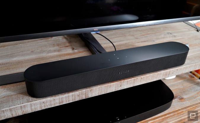
Devindra Hardawar says there was plenty to like about the first-gen Sonos Beam. When it comes to the Beam Gen 2, he says the addition of Dolby Atmos means the device can deliver a wider, more immersive soundscape. With largely the same hardware — a center tweeter, four mid-woofers and three passive radiators — this soundbar relies on more processing power to simulate the Dolby Atmos experience. Devindra says it worked surprisingly well during his testing, but wasn’t a replacement for having actual speakers dedicated to blasting height channels.
He liked that the Beam Gen 2 was still surprisingly compact at 25.6 inches wide and weighing six pounds, and that it has the same Ethernet, HDMI and power ports on the rear. And he appreciated how easy the set up was via Sonos’s app. In testing, the new Beam excelled during action movies: while watching Baby Driver, Devindra said it was a richer experience and even the dialog sounded clearer, too. However, music playback wasn’t as dramatically different and Dolby Atmos support for Amazon Music will come later this year. Sonos also makes it easy to synchronize audio throughout your home and the Alexa integration works well. Devindra says it’s a solid sub-$500 soundbar to take your movie-watching up a notch.
The Uno Synth Pro can produce glorious sounds
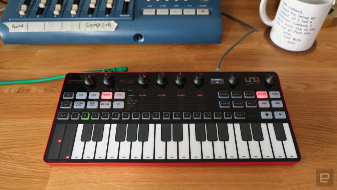
With three oscillators, two envelopes, two LFOs, two filters, an analog overdrive and twelve digital effects, the Uno Synth Pro offers plenty of options for sound design. Terrence O’Brien tested the smaller $400 Desktop model, which features a set of touch keys and an all-plastic body (the synth also comes in a standard $650 Pro model with a 37-key Fatar keybed and a partially metal chassis). He said that the overall construction feels solid enough, the buttons are decent, the knobs offer good resistance and the screen, while small, provides all the information you need.
However, the gray, black and red color scheme made it difficult to quickly spot the controls, especially in darker environments. He also didn’t like the four top knobs that change all the parameters. But Terrence said his biggest issue was with the touch keys and strips — they felt unresponsive and would occasionally fail to detect touches, which was worse in three-voice paraphone mode. The pitch and mod strips behaved similarly. But his frustrations were largely forgotten once the synth started making noise: Terrence said the oscillators have body and grit and the saw wave just rips. Overall, he was impressed enough with the wealth of sound design tools and the quality of the oscillators and filters to call himself a convert.
Owlet’s Smart Sock Plus can keep monitoring older kids

After using both the second- and third-generation Smart Socks on my twins, I’d grown accustomed to being able to check in on their stats anytime from my phone. When they aged out of their socks, it was an uncomfortable transition — for me. Owlet says I’m not alone: 72 percent of the users they polled indicated they’d like to keep using the device to measure their children’s heart rate and pulse ox levels. In response the company updated its algorithm and made the Smart Sock Plus, which can accommodate children up to five years old or 55 pounds.
Aside from the larger sock and better algorithm, the Smart Sock Plus is much the same as the standard, third-gen device. In testing, the Plus seemed to fit better but I had to employ work-arounds to keep my kids from taking them off. I also noticed fewer alerts about a misaligned sock, which was a welcome update. At $359 the Smart Sock Plus is pretty pricey for new users, but the $69 expansion pack available for existing customers is likely to do well as it extends the life time of the sock considerably.
The Nintendo Switch OLED edition is nice, but not necessary
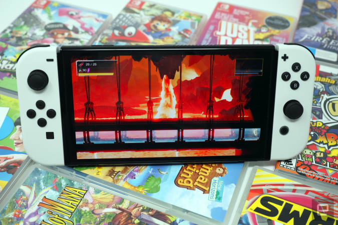
Kris Naudus is plain: the new Nintendo Switch OLED, while lovely, isn’t a must-have. Though the refreshed handheld system features a brighter, 7-inch OLED screen, a new stand ideal for tabletop mode, an Ethernet port and a new coating which feels good in hand, not much has changed under the hood. The CPU and GPU remain the same, ensuring the future game titles will be compatible with existing Switch and Switch Light devices, and the infamous Joy-Cons haven’t been redesigned (though hopefully the drift issues have been solved).
Kris was impressed by the new stand, which is a Surface-style panel that stretches the length of the entire unit and can be left in any angle you prefer. However, because the USB-C port is still on the bottom which means it can’t be charged while set in tabletop mode. She also liked the slimmer bezels and coating on the frame and said the new buttons look sleeker and feel better. It’s the same height and width as the original Switch, too, so it will fit with all existing accessories. And though the battery is the same, it appears to be more power-efficient thanks to the new OLED screen. Despite that, Kris says unless you’ve given up your original or really need the OLED screen, you’ll be fine sticking with your current system.
The Carol smart exercise bike is for big pocketbooks
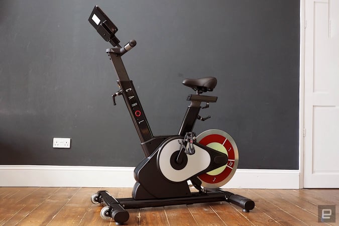
Daniel Cooper would tell you that he enjoyed his time with the pricey Carol smart exercise bike, a machine intended to be used in short workouts of eight minutes and 40 seconds. Using the methods employed by Reduced Exertion, High Intensity Interval Training (REHIIT), the bike features exercise videos that you can follow via the 10.1-inch color touchscreen if you subscribe to the company’s service. Because the screen is a Lenovo tablet, you can run third-party apps through it like Peloton’s so you could take classes from there, to. Daniel says the Carol app is clean and colorful: the UI flashes when you hit a high intensity phase and power output visualizations were particularly great.
The bike itself looks like any at-home exercise bike with a large, real-slung flywheel and a drive unit to house the system to electronically control the resistance. The short handles contain heart rate-monitoring electrodes and the height of the handlebars and seat height and distance are all adjustable. After spending time with it, Daniel admits he feels like his fitness and mood both improved, but the $2,400 price tag is especially hard to swallow.


